CITA Kaizen
Visual Identity & Social Media Graphics
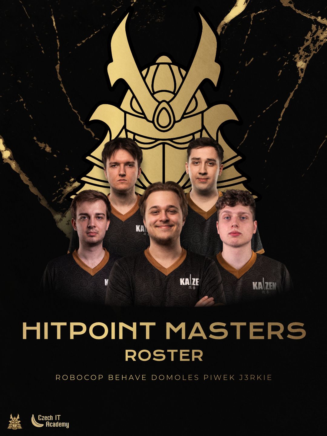
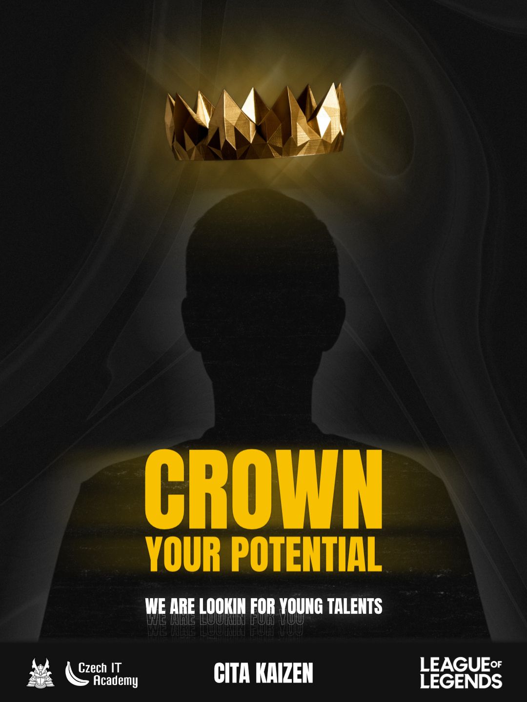
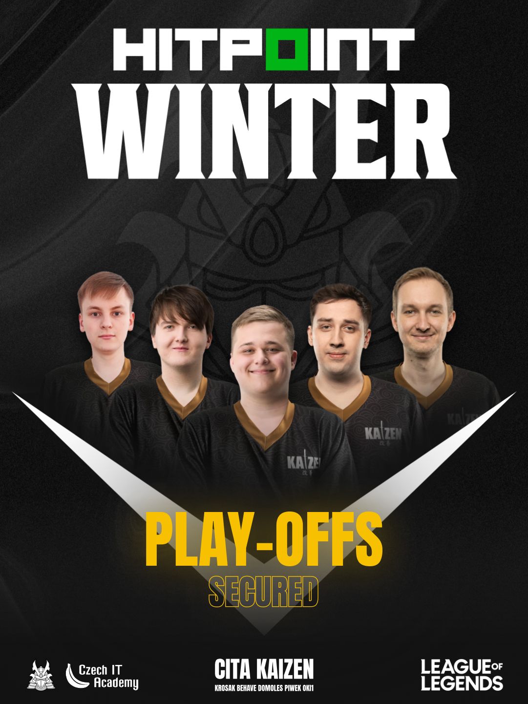
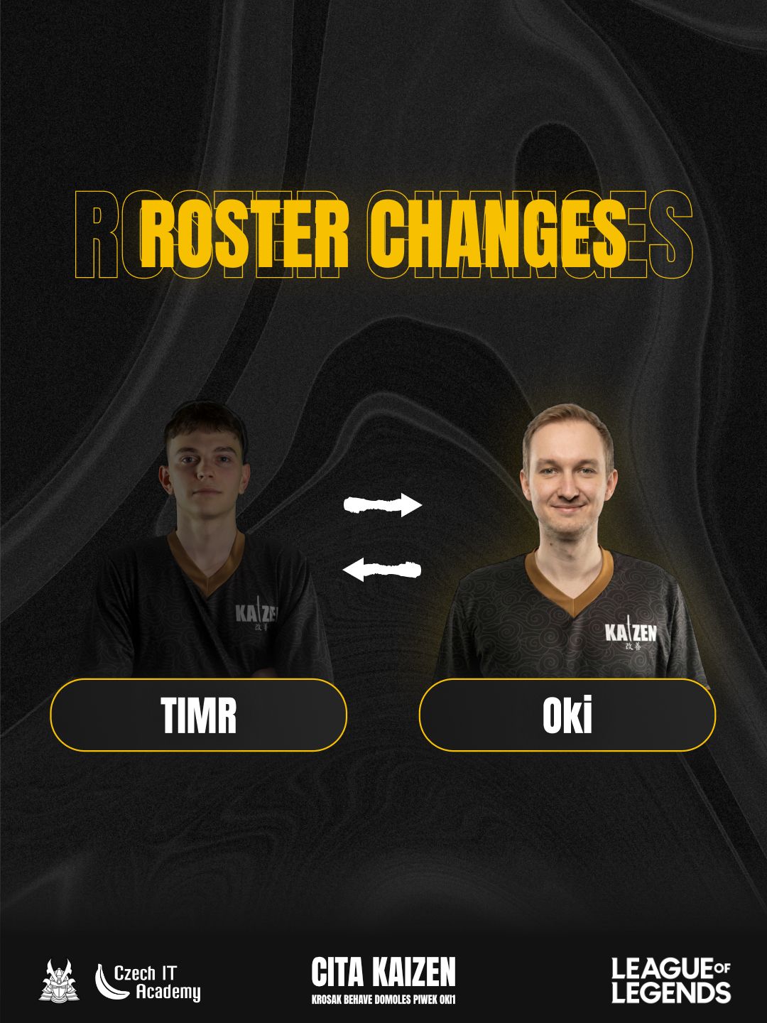
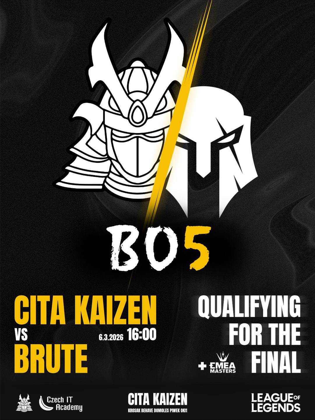
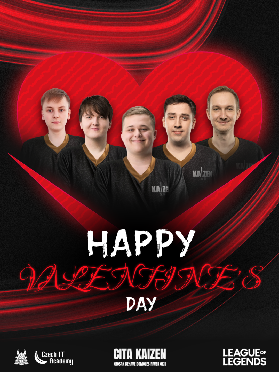
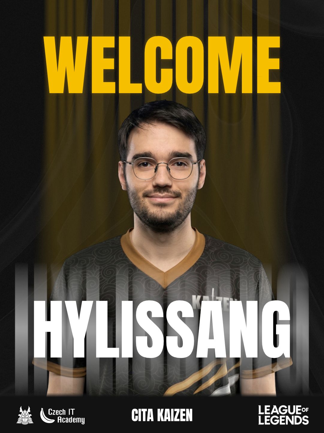
My collaboration with the eSports team CITA Kaizen has been a long-term journey of visual evolution, perfectly mirroring the very philosophy of "Kaizen" itself—continuous self-improvement. Tasked with crafting a comprehensive multi-season identity, I set out to build a dominant visual presence that would resonate across their entire competitive journey, from recruitment campaigns to major league rosters. The goal was to give the brand a premium look that matched their ambitions and skills.
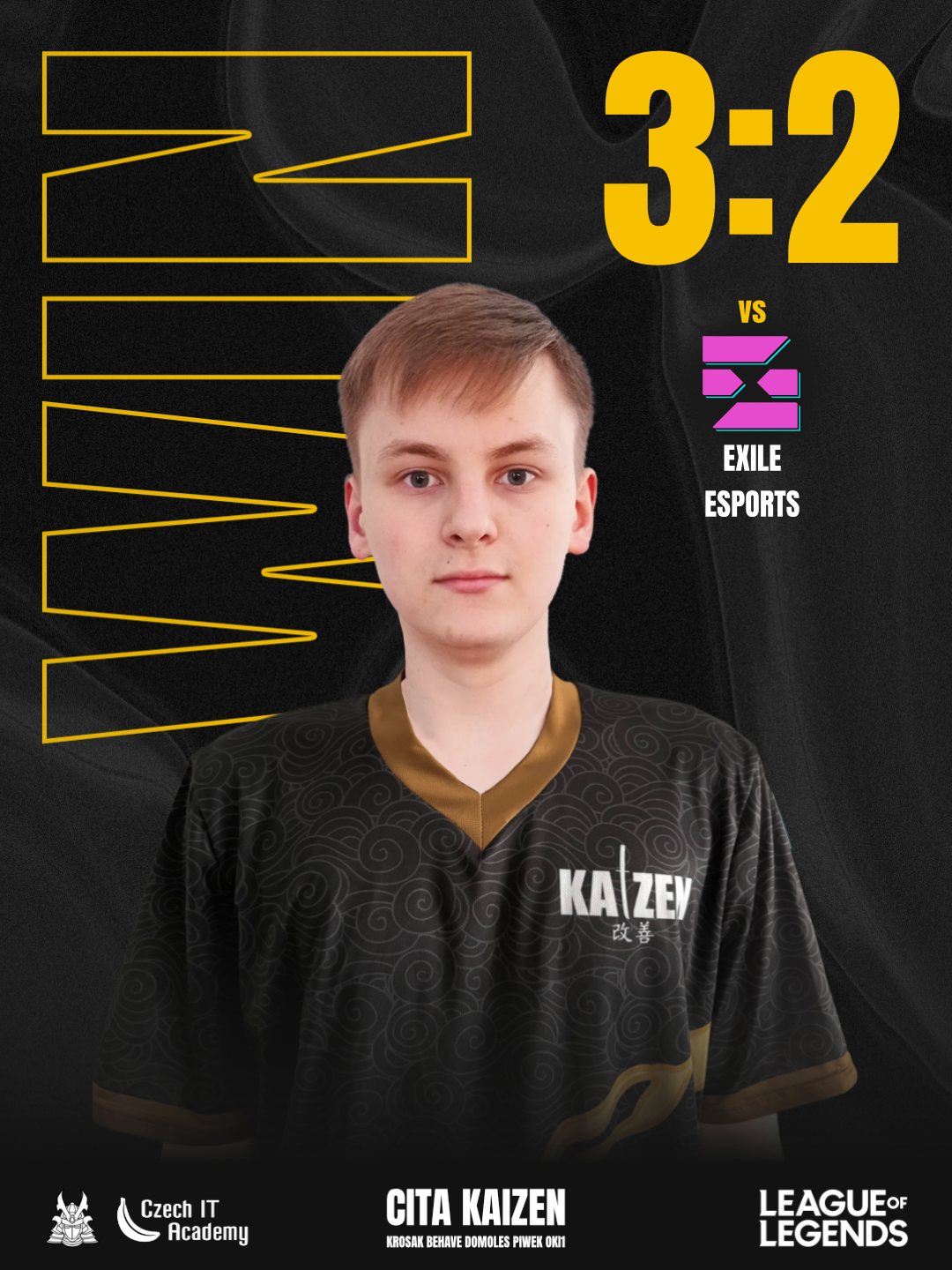
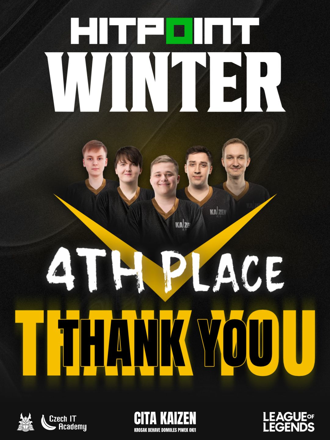
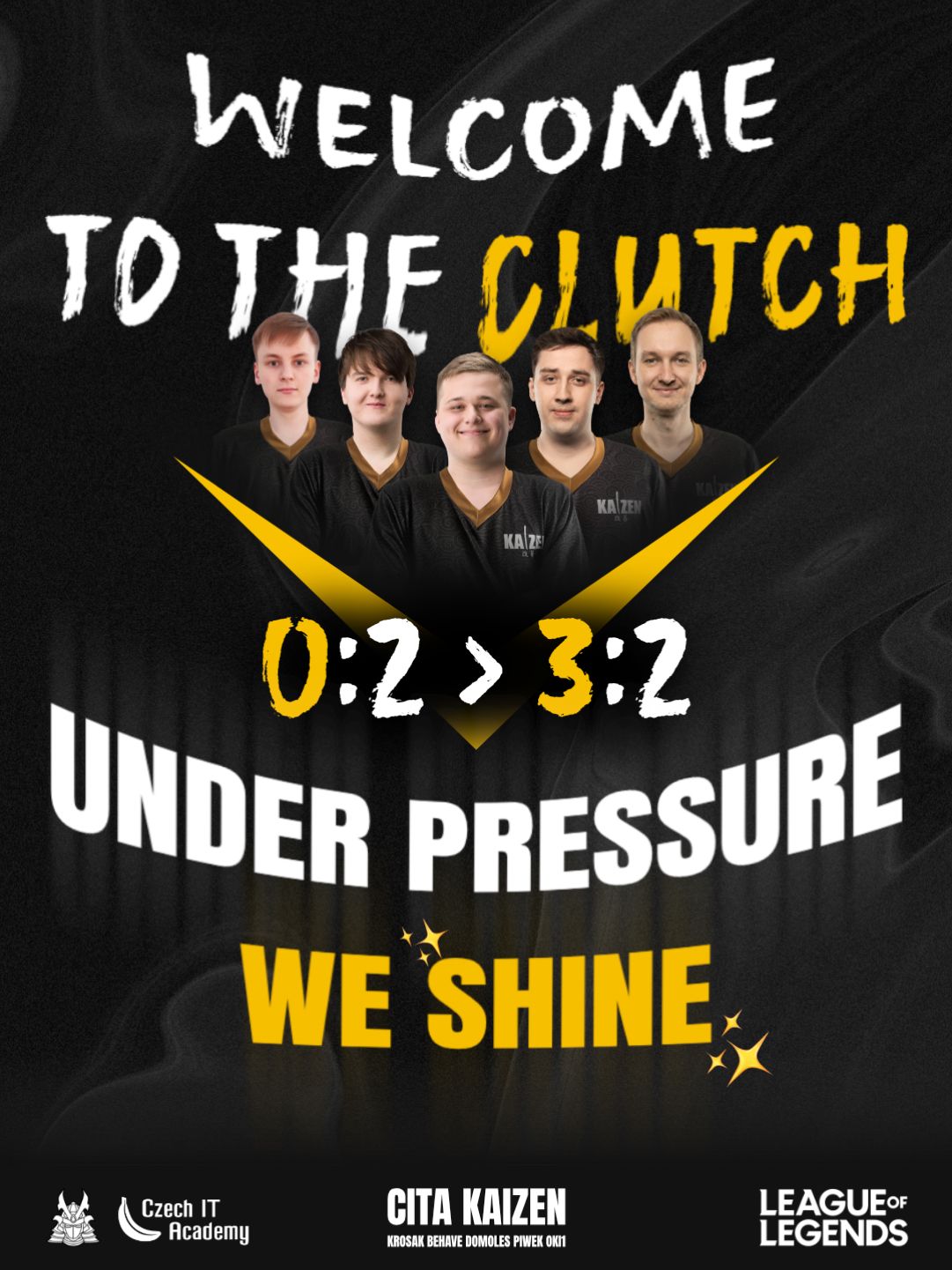
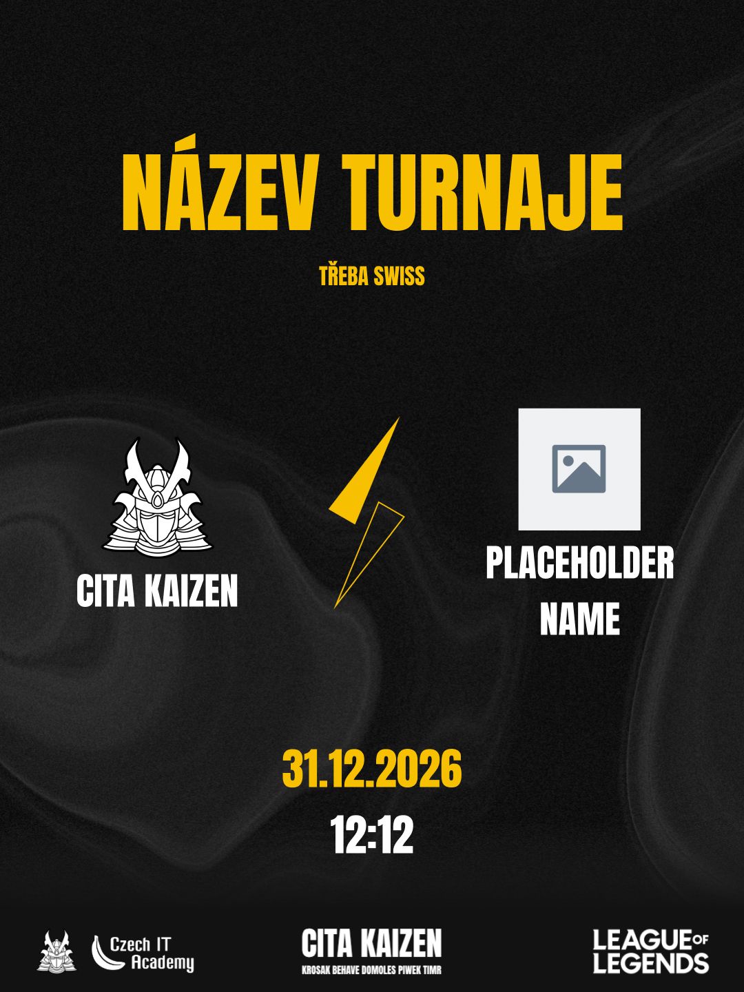
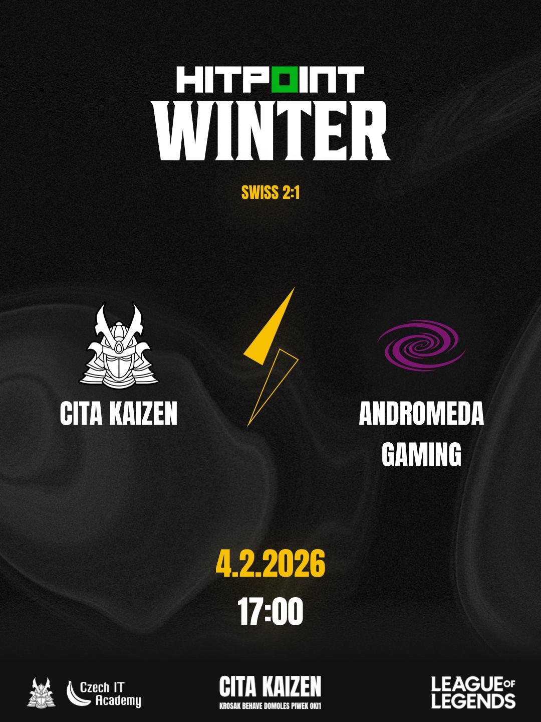
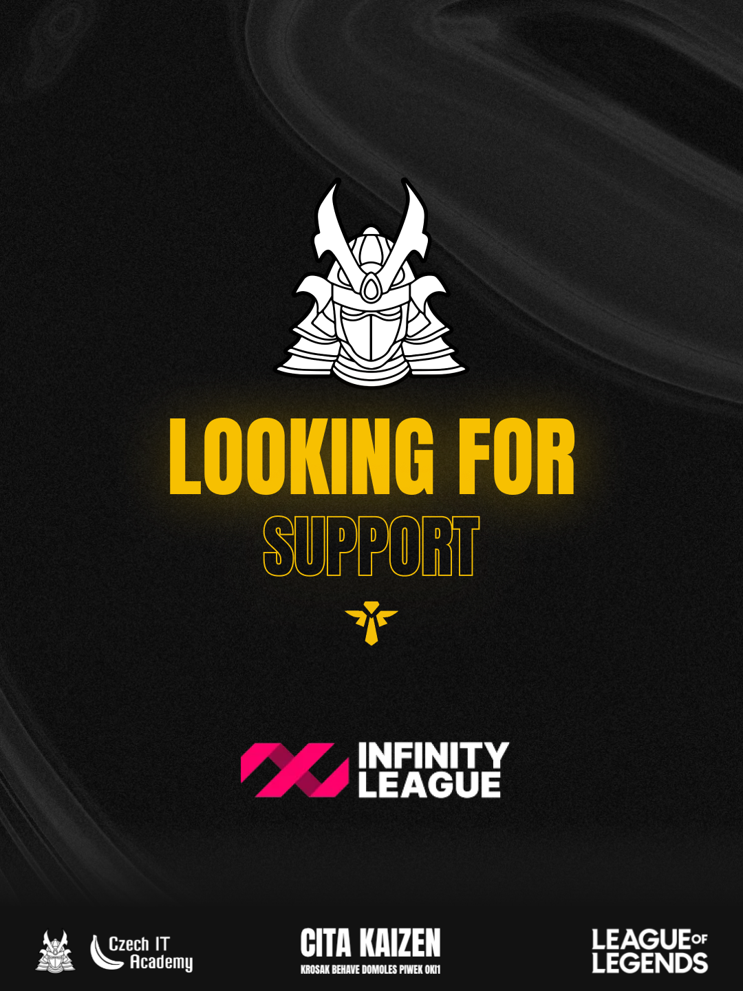
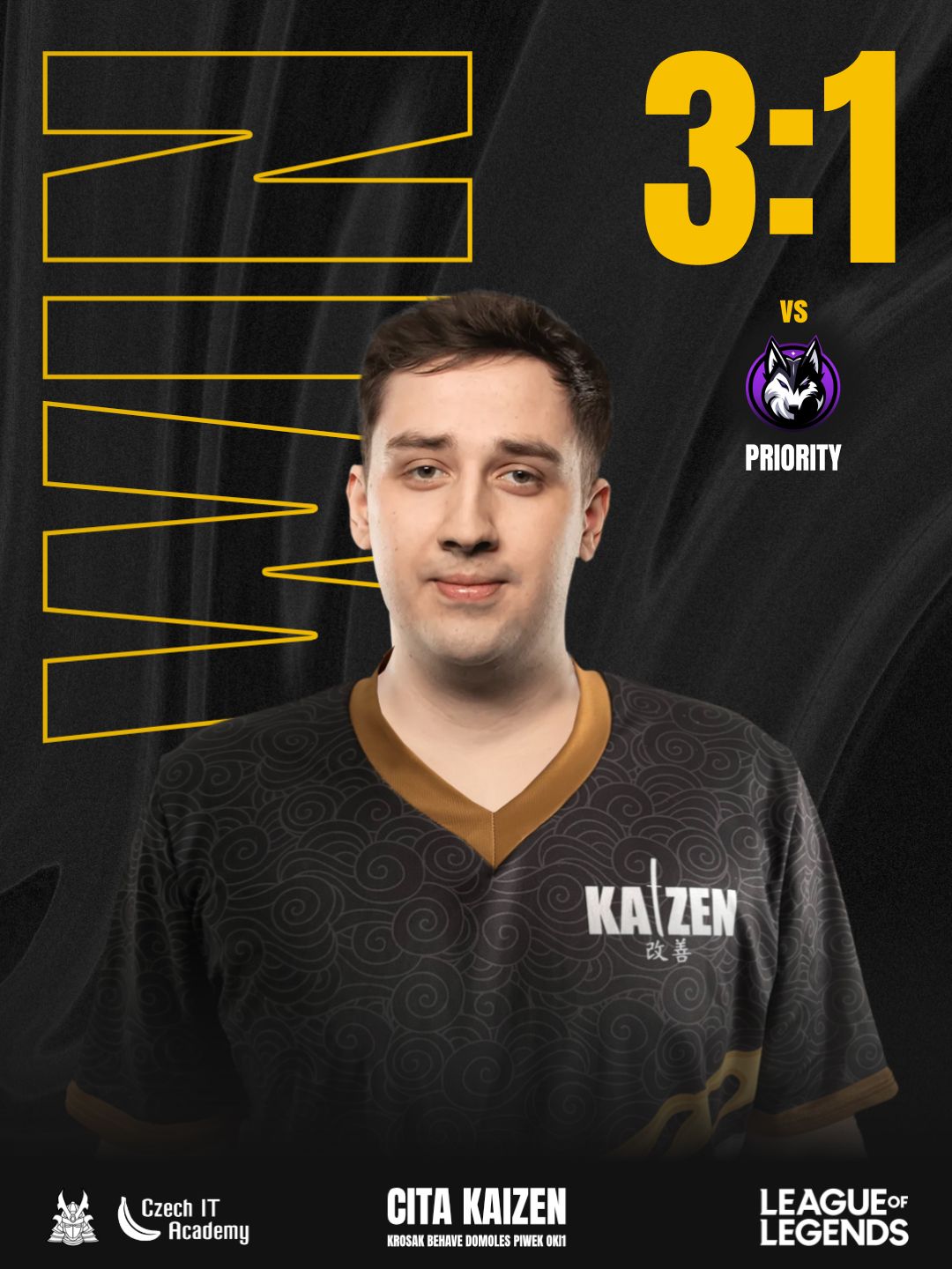
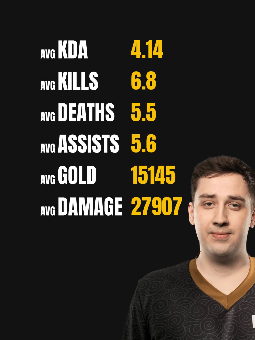
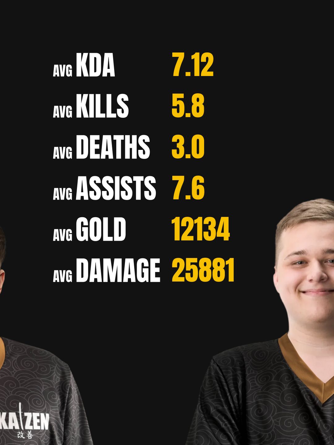
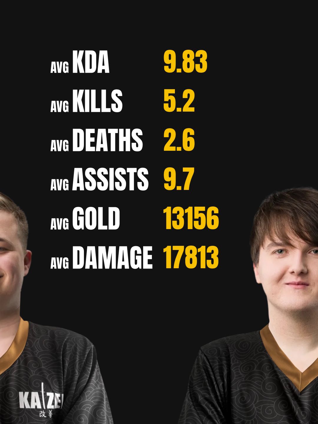
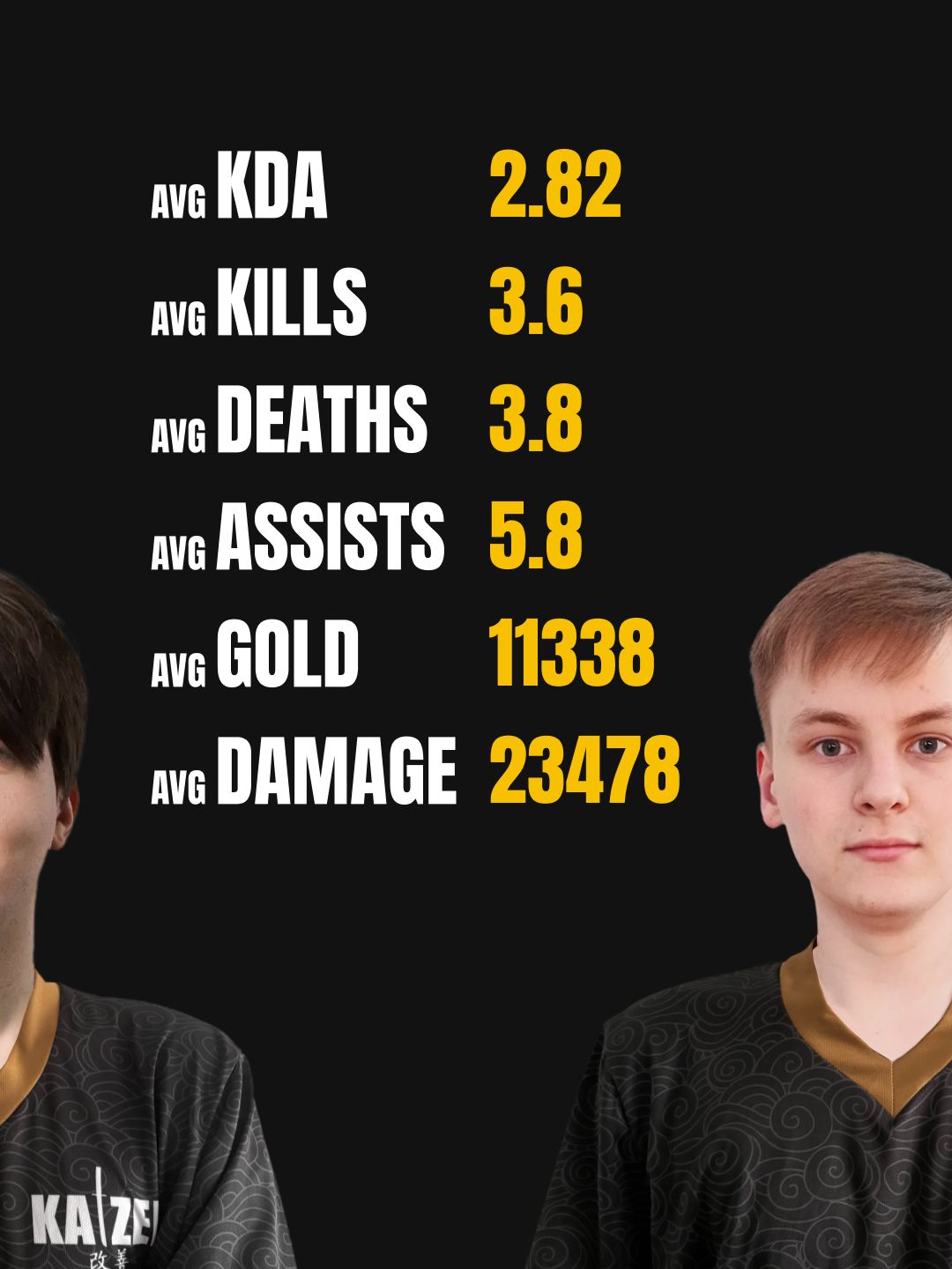
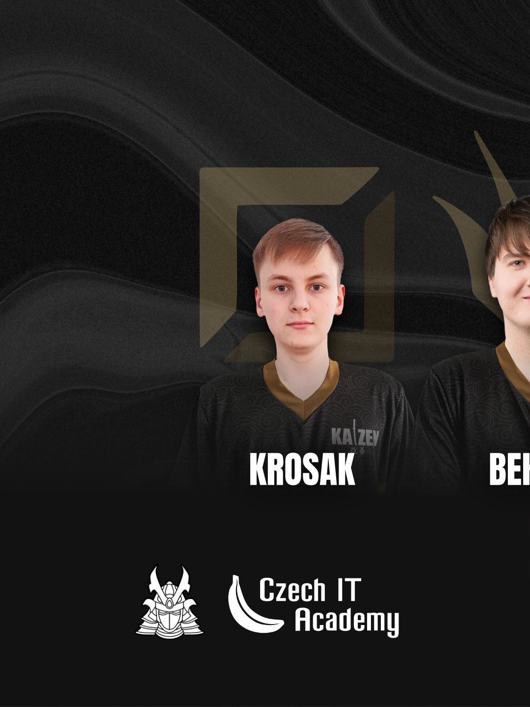
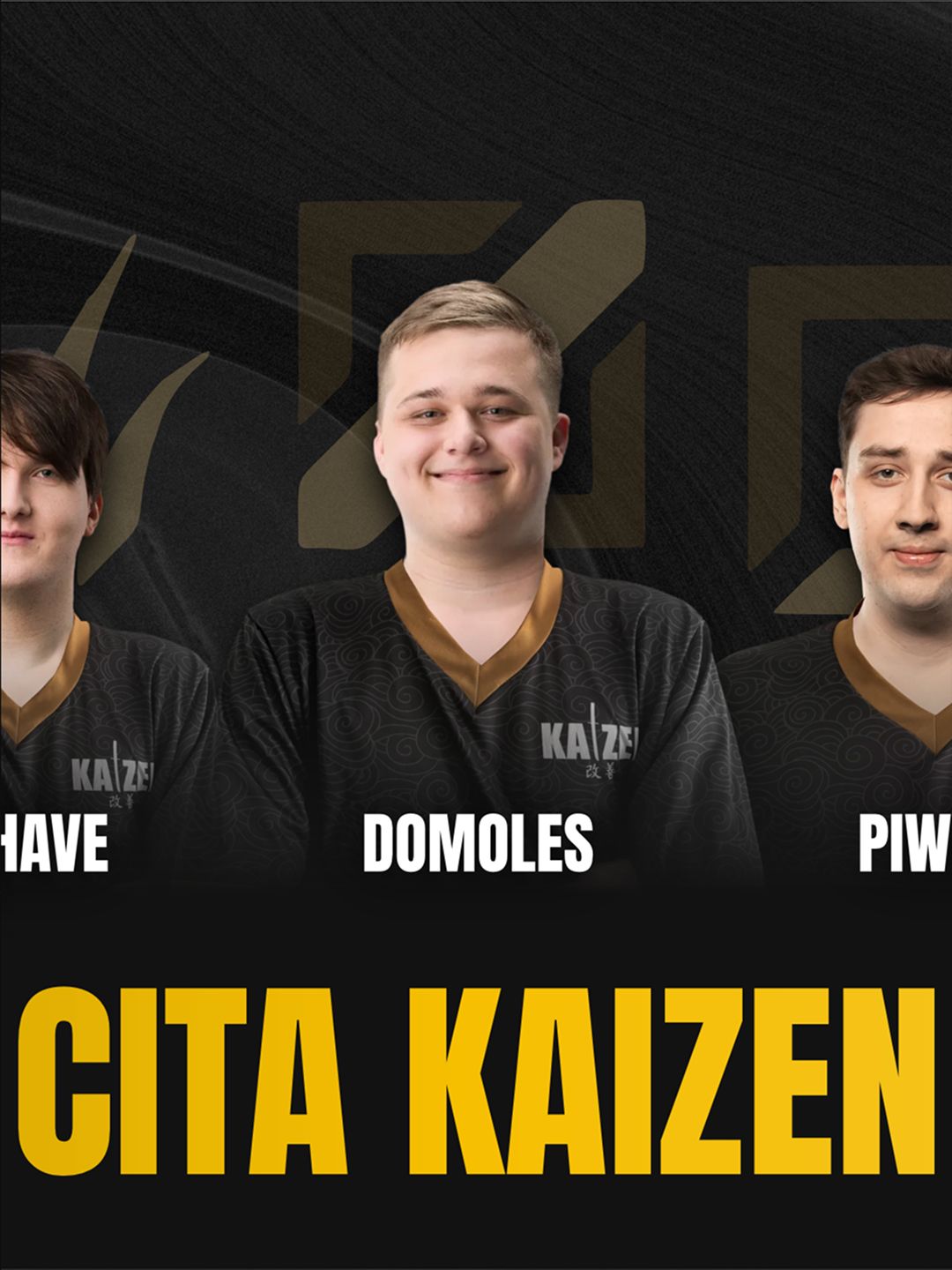
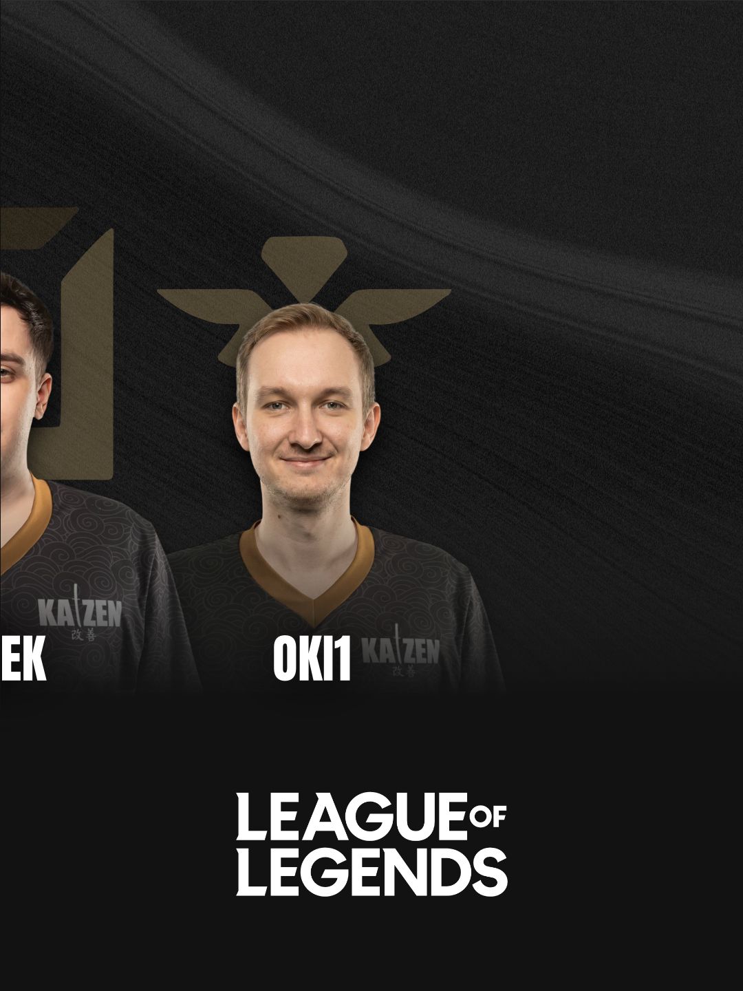
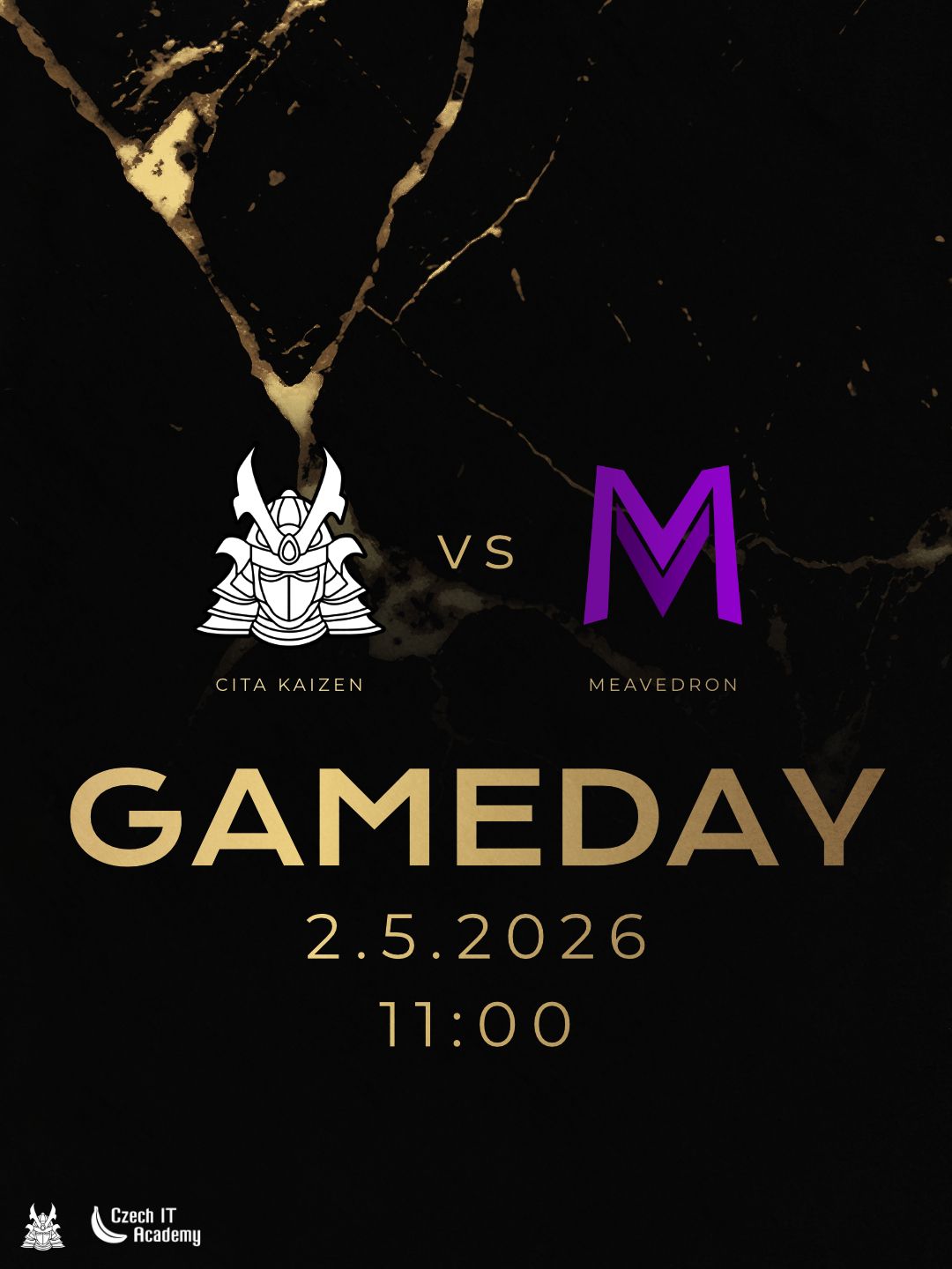
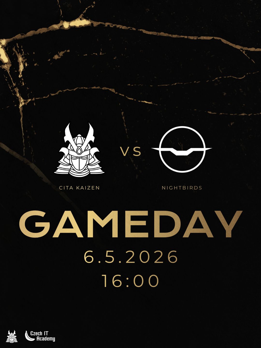
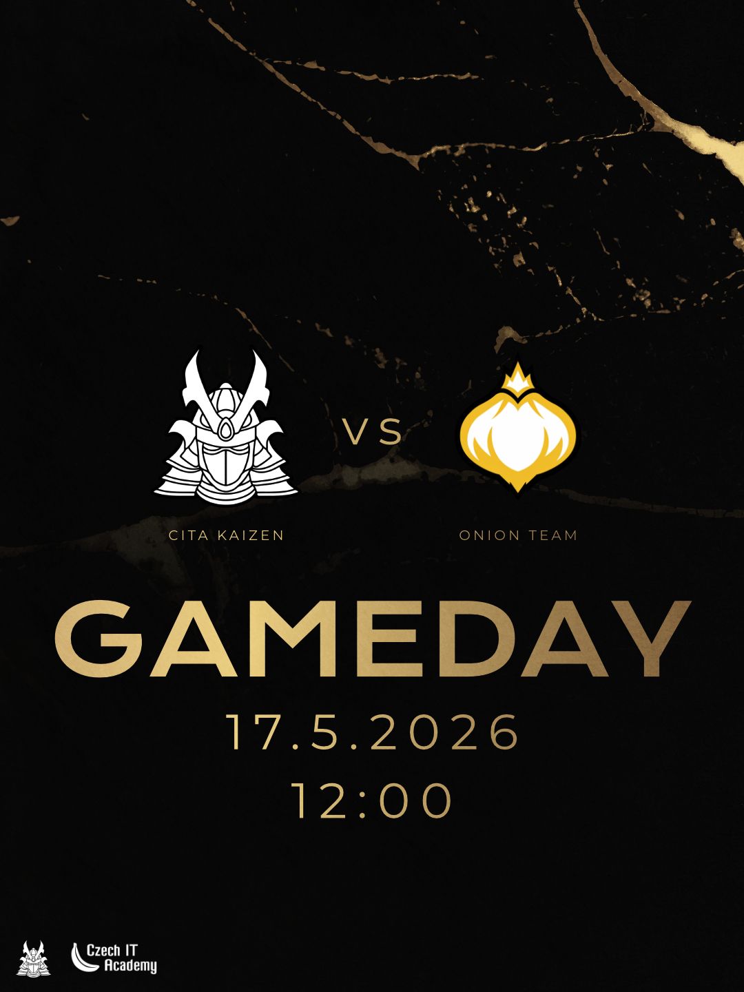
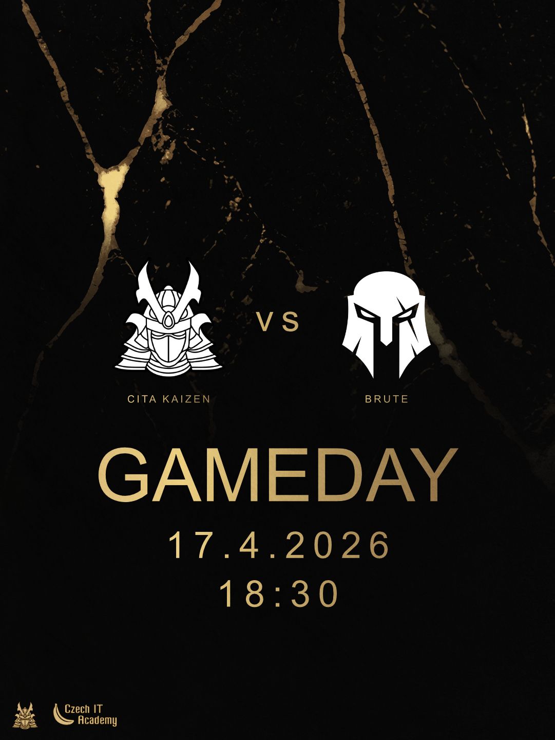
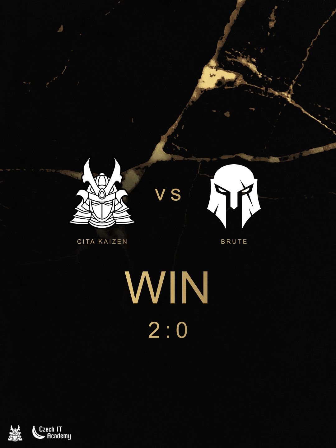
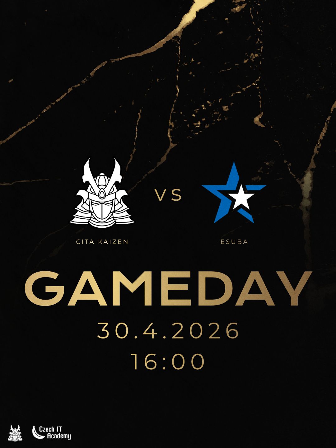
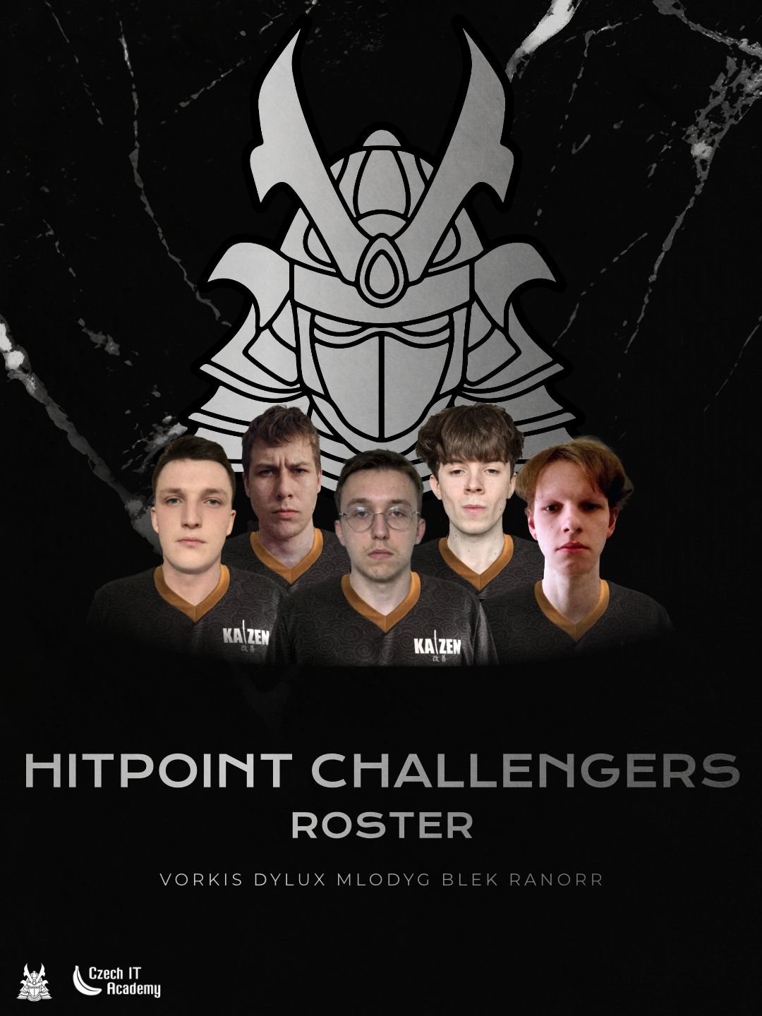
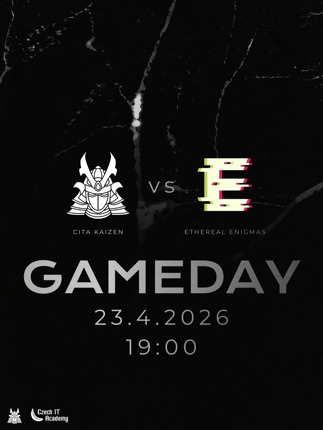
In the first season, I developed a bold, uncompromising design system rooted in Japanese aesthetics. Drawing heavy inspiration from traditional ink, inkography, and calligraphy, I utilized dynamic textures and stark typography to deliver straight, powerful messages. For the second season, I elevated the visual direction into a realm of refined elegance and clarity while maintaining its inherent boldness. I established a clear visual hierarchy between their two competitive tiers: utilizing striking, pure gold accents for the main Hitpoint Masters League, and a sleek silver palette for the Hitpoin Challengers League. When faced with an initial lack of official player photography, I proactively utilized advanced editing tools to digitally composite the players into their team jerseys, ensuring a flawless, professional presentation across all deliverables.
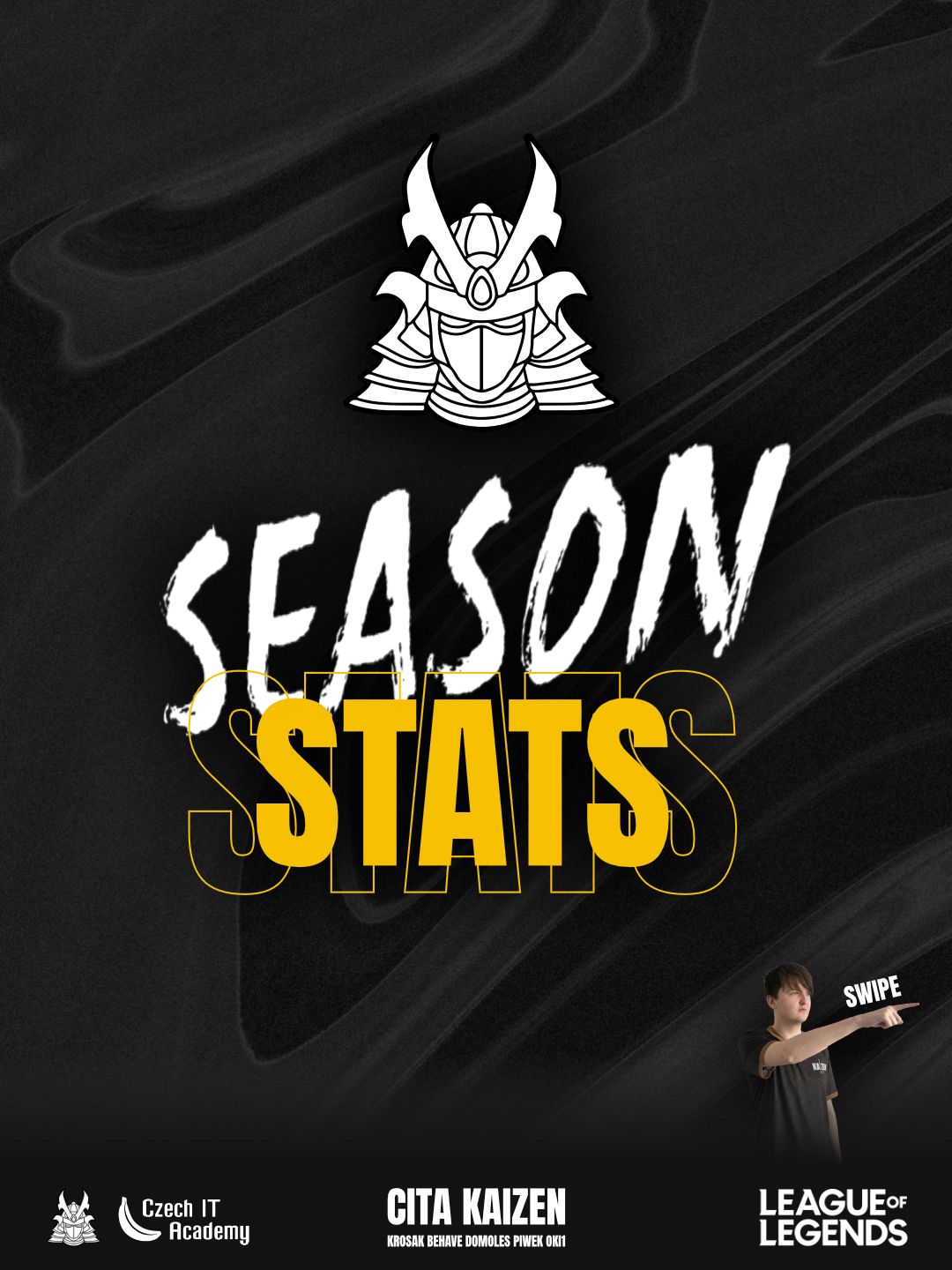
Every visual element, from the imposing samurai helmet crest to the elegant background textures, is infused with the team's core values of discipline and unyielding strength. The typography is designed to be instantly readable and highly impactful. The ultimate achievement of this extensive project is undeniable brand recognition. By meticulously refining their aesthetic, I created a visual signature so strong and distinct that the moment fans and competitors see it, they instantly know: "This is Kaizen, and they are awesome."